Healthcare SERIES • Project FEATURE
Cutting-Edge Design – Clínica Dental Fuentes Vera by Murillo y Hernández Arquitectura

The design begins with the first volume, strategically placed at the entrance, housing the office and the X-ray room. Together with another volume positioned on the opposite wall, it forms a spacious and welcoming reception area.
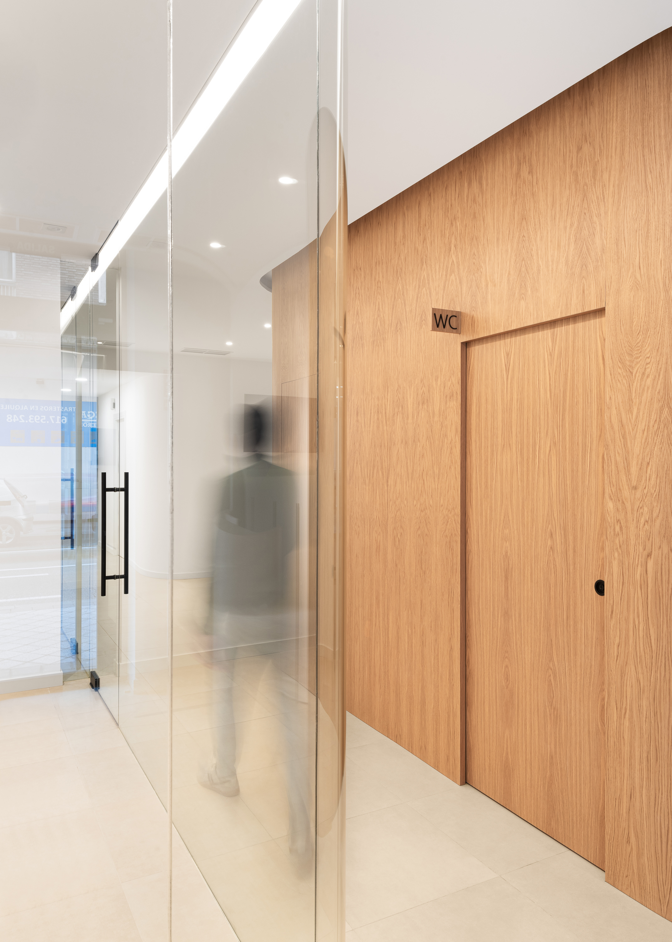
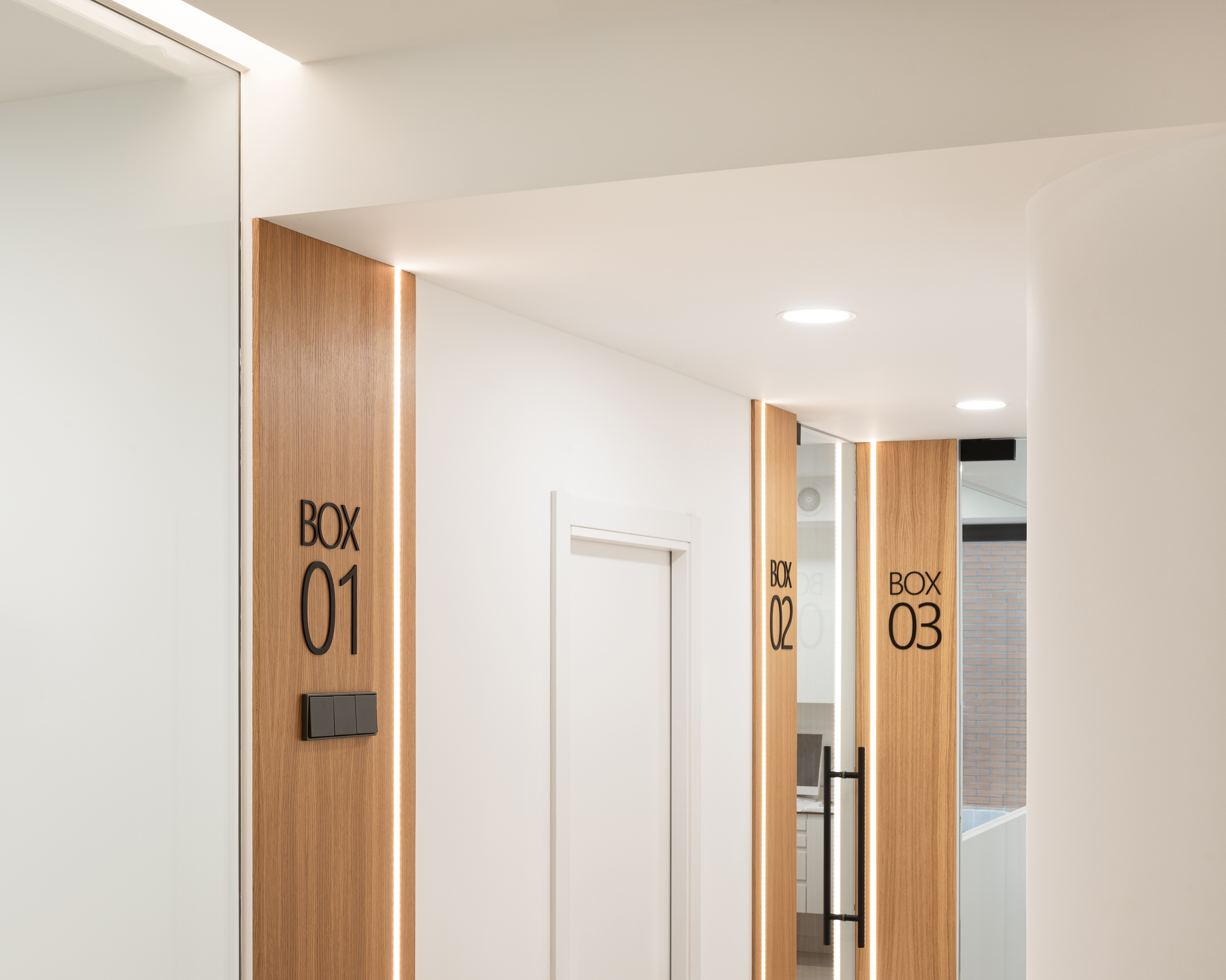
This initial open space sets the tone for the rest of the layout: a seamless transition that combines clinical functionality with an aesthetically refined environment. Beyond the reception, the second volume works in tandem with the third, which contains the first clinical treatment room. These two volumes define two distinct waiting areas on either side, ensuring privacy and comfort for patients. This interplay of solids and voids not only structures the space but also creates a rich and varied spatial experience as visitors move toward the main corridor, where the remaining rooms are located.

"Where the warmth of design meets clinical precision, a space is born that redefines the care experience."
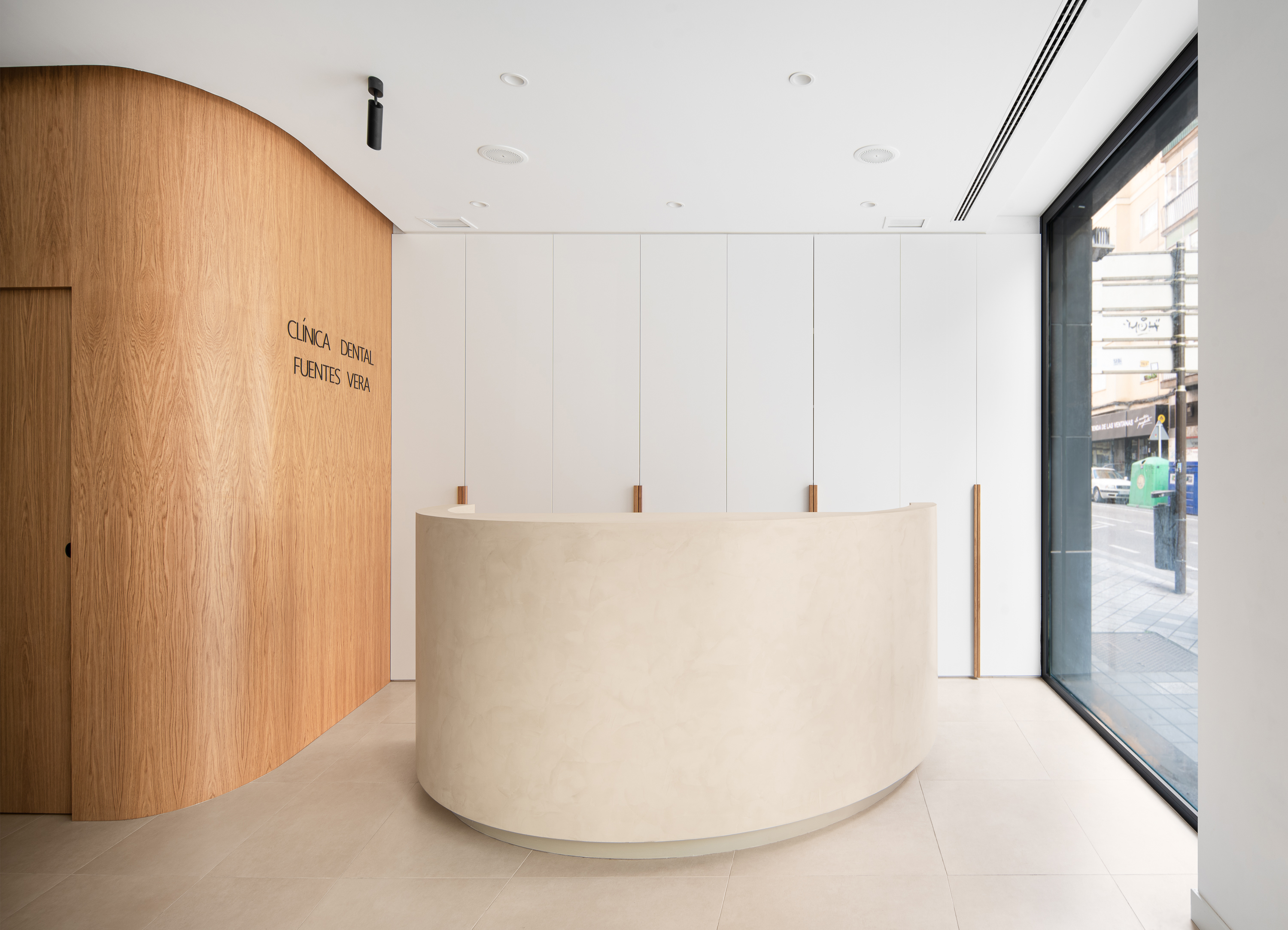
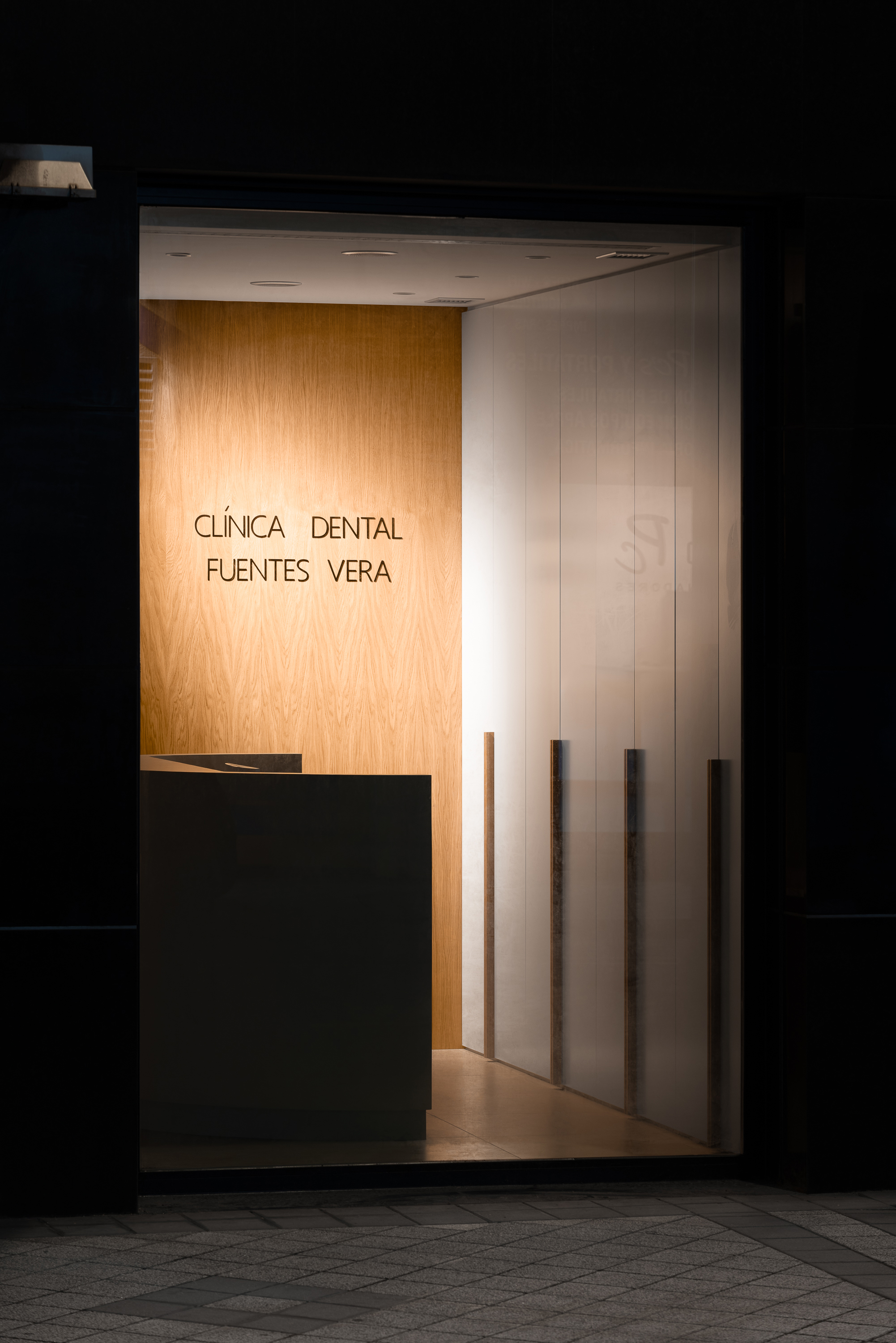
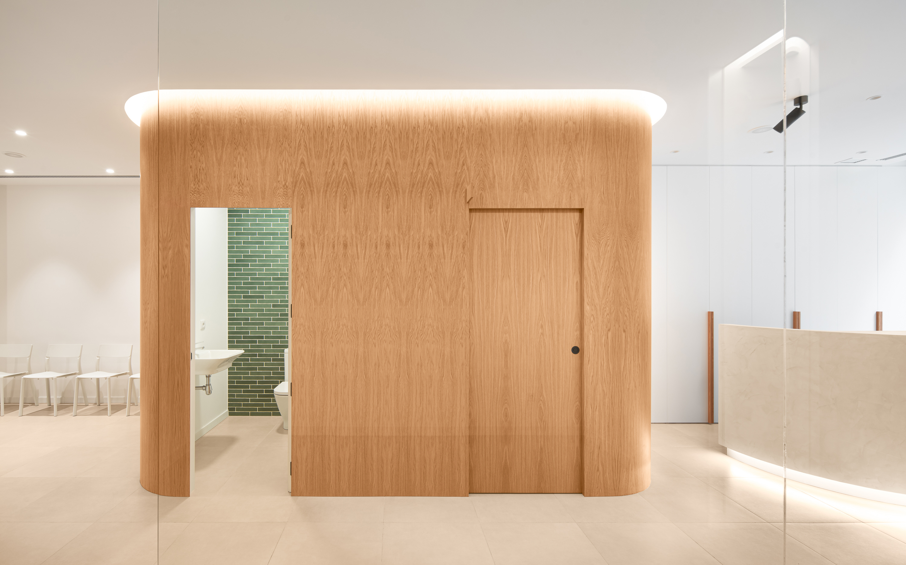
At the heart of the design lies a central volume that takes on a starring role. It houses the restrooms, but its significance goes far beyond function. With rounded corners that soften transitions, this volume stands out due to its oak veneer finish, bringing a sense of warmth to the predominantly white environment. Additionally, its strategic placement makes it the ideal canvas for the clinic's signage, visible from the exterior through carefully positioned glass panels. Clínica Dental Fuentes Vera is not just an example of effective architectural design but also a testament to a commitment to user well-being. Every decision—from the arrangement of volumes to the choice of materials and lighting—aims to transform the patient experience into something more than a routine visit, offering a comfortable and visually engaging environment.
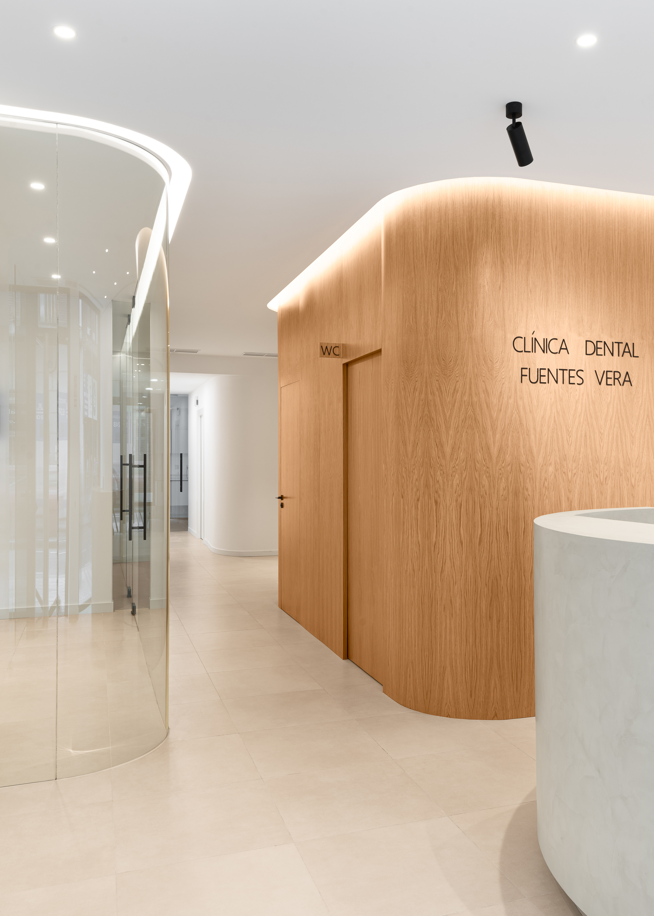
The contrast between the oak finish and white surfaces creates a visual balance that reflects the clinic’s ethos: professionalism with a human touch. This central volume not only organizes the flow but also acts as a visual anchor, seamlessly blending aesthetics and functionality.

"Light and materiality converge to create an environment that inspires trust and well-being."
Lighting plays a key role in the design. The elongated geometry of the space is maximized by allowing natural light to flow in from both ends. This layout ensures that the spaces are bathed in direct, linear light, highlighting the materiality and interior volumes. Artificial lighting complements this strategy, accentuating key elements such as the central oak volume and the waiting areas. This thoughtful balance of lighting enhances the perception of the space while creating a welcoming and calming ambiance—essential in a dental clinic setting.
Murillo y Hernández Arquitectura showcase how even the most challenging spatial constraints can inspire innovation. Here, the narrowness of the site doesn’t limit the design but rather sparks a solution that optimizes functionality without sacrificing beauty.